8 Graphic Design Mistakes to Avoid
From social media graphics and website layouts to creating a cohesive grouping of promotional products, there are plenty of opportunities to flex your creative muscles and grow your business at the same time. Whether you’re trying to create a product mockup, designing a new logo, or putting together some print marketing for a new campaign for the first time, creating new artwork doesn’t have to be scary! We’ve put together some of the most common graphic design mistakes and how you can avoid them.
1. Too Many Fonts
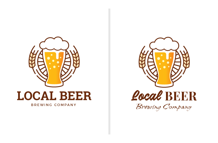
The first mistake that stands out when looking at a novice design vs. a professional design is the number of fonts used. It’s hard to understand the message of the piece if there are too many distracting fonts involved. As fun as it can be to play with fonts to convey different feelings and messages, brands should pick two or three fonts maximum on any design piece. Using a single font can also be impactful since it adds continuity and establishes your brand identity. Make sure you keep the size of the piece in mind when selecting the number of fonts as well as the amount of text. A smaller piece, like the logo above, can only support one font, while larger or more complex pieces like your website can handle a little more creativity.
Also, keep in mind the kerning of your fonts, this means the spacing between the letters, which makes a big difference in the finished product of your artwork. Adjusting the space between letters can make the words more legible and help the overall appearance of the words.
2. Using Stock Images

Stock images can be a helpful and affordable solution when you’re working on a project that requires specific images. However, using too many stock photos can make your project look cheap or unprofessional. Many common stock photos become used over and over again which makes it a dead giveaway when you put them in your marketing piece. Also, make sure you are properly purchasing the photos you do end up using to avoid sending out photos with a watermark or ones that are low resolution.
3. Not Proofreading
Make sure you are always checking over the spelling and grammar before sending a piece to print or hitting send on an email. While a misused comma or other punctuation marks may not seem like a major problem, there are plenty of people out there that will notice common issues like that and ignore the rest of the project. For example, if you are distributing leaflets as part of your ad campaign, and if the leaflet design has many spelling mistakes in the text, it will backfire. Customers may not take those mistakes kindly, and simply deem your business as unprofessional due to tiny spelling mistakes.
What can you do to avoid this problem? It might seem unlikely that you would miss an obvious error, however it can be very easy to overlook a typo even through multiple rounds of edits. So, get a second pair of eyes on your work; have your coworkers look through your copy and hopefully they will catch any proofreading errors you might have missed the first time!
4. Choosing the Wrong Colors
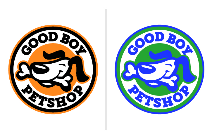
Similar to using too many fonts, choosing too many colors or choosing the wrong colors can also make a design ineffective. It can be distracting to use too many bold colors in one piece. In the example above, the bright colors on the right side make the logo appear less clear and harder to read than the logo on the left that uses contrasting colors. So when creating new branding for your company or a new artwork, it’s important to start by creating a color palette. Each color palette you create should include both primary colors and secondary colors. Test your fonts along with these colors to make sure that text is legible whether standing alone or sitting on top of other elements.
5. Using Incorrect Hierarchy
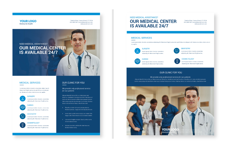
In graphic design, hierarchy is how a piece is organized so the audience knows which elements are the most important and how their eyes should move over the piece. When looking at the pieces above, the flow of the flyer on the left is easy for the eye to navigate and ensures your audience can find the most important information right away. While the flyer on the right has the eye jumping around looking for the important information. Hierarchy is the top design technique that ranks the importance of your information. Whenever you’re creating a new design there is typically one general message you want to communicate. Whether you’re communicating a sale, upcoming event, or new blog post, how you create hierarchy in your design will dictate what your audience takes away from your design. Hierarchy doesn’t just have to be font size or placement, you can also create effective hierarchy through colors, graphic elements, or the weight of the fonts you use.
6. Designing for the Wrong Medium
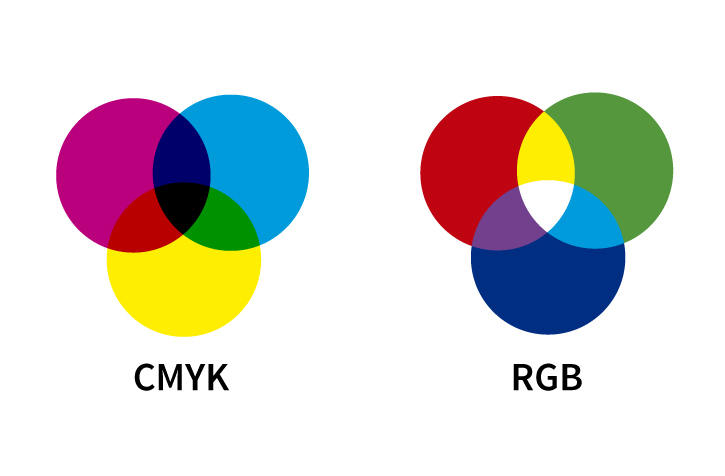
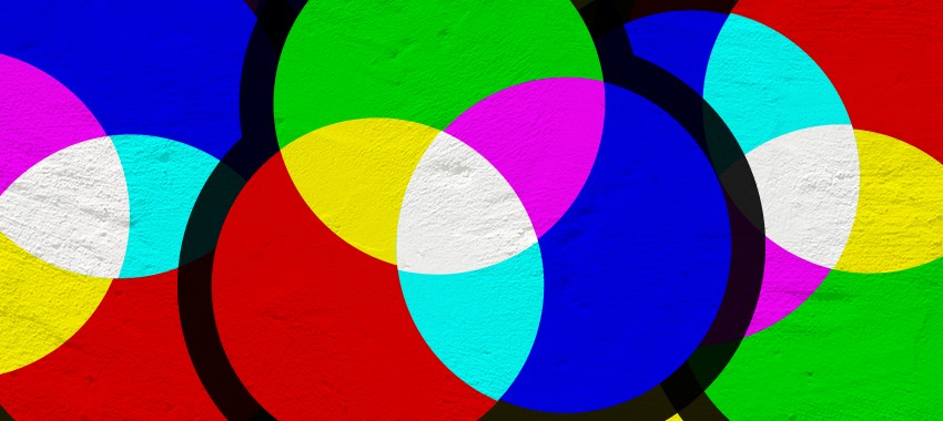
The first decision you should make when you are starting on artwork is where it will be appearing. Whether it will be used on social media, on your website, or printed in a magazine can make a big difference in how you should be creating your design. For example, if your design will be printed, you will need to use CMYK color mode which stands for cyan, magenta, yellow, and key (black) which is used for four-color process printing. If it is going to appear on a digital screen (tv, computer, phone, or tablet) it should be created in RGB, which stands for red, green, and blue – the colors of light screens use to display a range of colors. If you created a design in one format and printed or published it in the other it would look completely different because the colors wouldn’t translate!
7. Saving in the Wrong Format
When choosing a file format for your design image, think about whether or not the image needs to be in raster or vector format. Raster images are made up of pixels while vectors are made up of geometric lines and curves, which means they can be scaled to any size while keeping their shape. You may also hear vector files referred to as AI files because vector artwork is typically created in Adobe Illustrator. If you are worried about your design getting pixelated, a good rule of thumb is to make your design bigger than it needs to be. You can always reduce resolution, but you can never increase it. Also, consider if the design will be printed or displayed online; all of these things will make it easier to choose the perfect way to save work.
8. Not Creating a Versatile Design
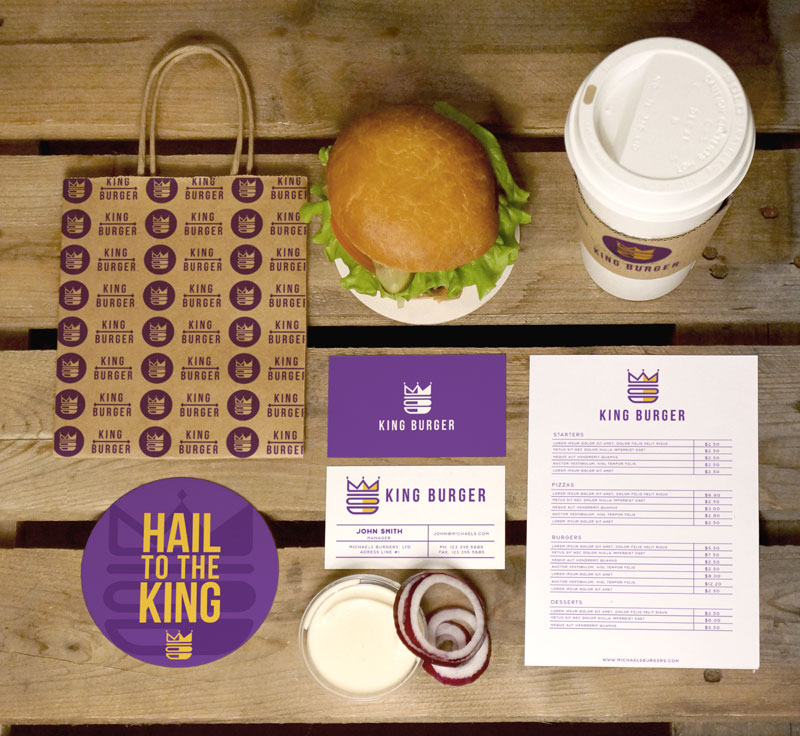
The best graphics are evergreen and multi-purpose! If you’re creating a logo, think about how it will look on promotional products, how it will look in a 1 color or full color, and how it can be simplified to ensure you’re able to use specific design processes with your logo. This will help establish your brand consistency and save you time and money from having to redesign artwork for new projects down the road.
Now that you know what mistakes to avoid, you’re ready to take your promotional products to the next level with the perfect logo for every product. If you need a virtual mockup of your logo on one of our products, we’ve got you covered. Contact us today, we’d be happy to help you out!